
CSS - Flex 屬性設定說明
flex 提供 UI 的空間佈局與內容項目的對齊設定,對於響應式的設計提供另一種彈性的選擇。
flex container 有以下的設定值:水平軸 (main axis) 與垂直軸 (cross axis) 的起點和終點 (X: main start, main end/ Y: cross start, cross end),flex container 內的 flex items 有水平尺寸和垂直尺寸 (main size, cross size)。
flex 這個屬性分為二個部份,一個是針對父層 (parent, flex container),一個是針對子層 (children, flex items),flex 相關的屬性主要就是用來處理父與子的關係。
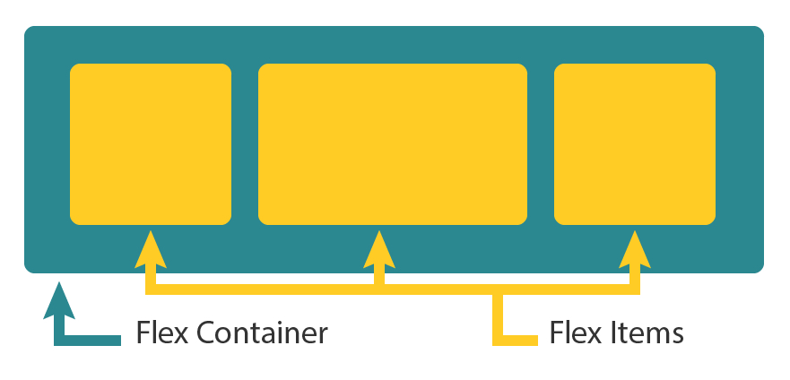
Flex Container: Properties for the Parent
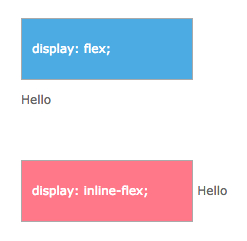
display
display: flex; 設定一個 flex container 的區塊 ,另一種設定值為 display: inline-flex; 則是設定為一個 inline 的 flex container 的區塊,表示其後方的元素不會換行。設定為 flex container 區塊之後,所屬的子元素就可以接受 flex 屬性的相關設定。
Note:CSS columns 對 flex container 無感
.container {
  display: flex;  /* or inline-flex */
}
flex-direction
flex-direction 屬性設定 flex container 中內容項目的排列方式與方向:
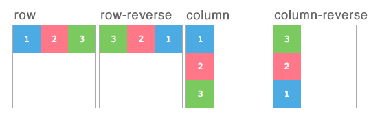
.container {
  flex-direction: row | row-reverse | column | column-reverse;
}
- row (default):從左到右橫排。如果書寫方向是從右到左的語系,則為從右到左的橫排。
- row-reverse:如果書寫方向是從右到左的語系,則為從左到右的橫排。
- column:從上到下直排。
- column-reverse:從下到上的直排。
flex-wrap
flex items 預設為一直線的排列填滿 flex container,使用 flex-wrap 屬性可以讓 flex items 在有需要的時候自動換行。
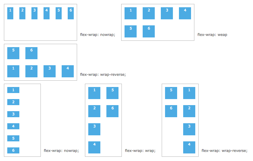
.container {
  flex-wrap: nowrap | wrap | wrap-reverse;
}
- nowrap (default):預設單行,一路排過去。
- warp:多行,從開端排向末端。
- wrap-reverse:多行,flex item 反轉排列。
flex-flow (applies to:parent flex container element)
flex-flow 是 flex-direction 和 flex-wrap 的組合體,可以一次設定二種,預設值為:row 和 nowrap。
flex-flow: flex-direction | flex-wrap

.container {
  flex-flow: column wrap;
}
justify-content
justify-content 用於設定 flex items 對 flex container 的水平端點 (main start/ main end) 作對齊的方式
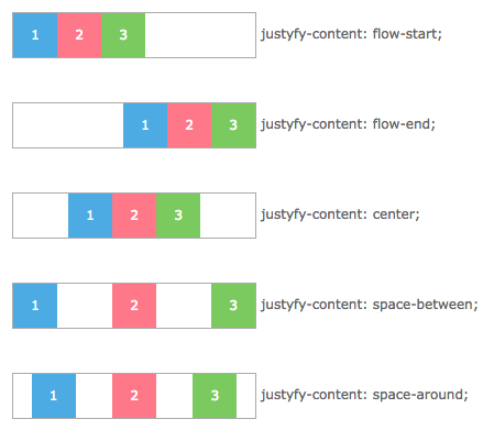
.container {
  justify-content: flex-start | flex-end | center | space-between | space-around;
}
- flex-start (default):flex items 對齊 main start,整包靠頂。
- flex-end:flex items 對齊 main end,整包靠底。
- center:flex items 整包水平置中。
- space-between:flex items 分散對齊,頭尾元素會靠齊 main start 和 main end。
- space-around:flex items 所以元素的間距均分對齊。
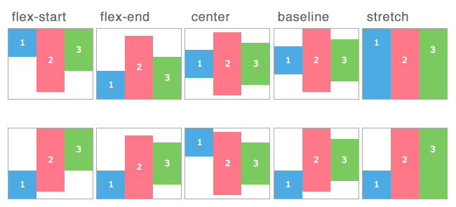
align-items
align-items 用於設定 flex-items 對 flex container 的垂直端點 (cross start/ cross end) 作對齊的方式
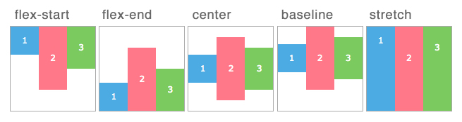
.container {
  align-items: flex-start | flex-end | center | baseline | stretch;
}
- flex-start:垂直置頂,對齊 cross start。
- flex-end:垂直置底,對齊 corss end。
- center:垂直置中。
- baseline:以 flex item 基線作為對齊基準。
- stretch (default):flex items 延伸拉展到 flex container 的高度,若 flex items 有設定寬(高),不會改動原有設定。
align-content
align-content 用於多行內容對齊,align-items 是處理 flex container 內單行元素的對齊。
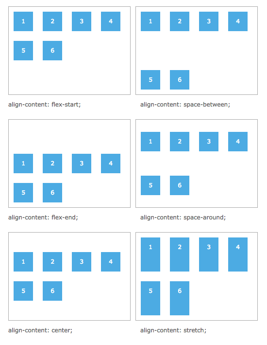
Note:只有一行時,這個屬性沒有作用;
.container {
  align-content: flex-start | flex-end | center | space-between | space-around | stretch;
}
- flex-start:flex container 對齊頂部的 cross start
- flex-end:flex container 對齊底部的 cross end
- center:垂直置中
- space-between:首行和末行分別對齊頂部和底部
- space-around:平均各行間距
- stretch:撐開 flex items 填滿 flex container
Properties for the Children (flex items)
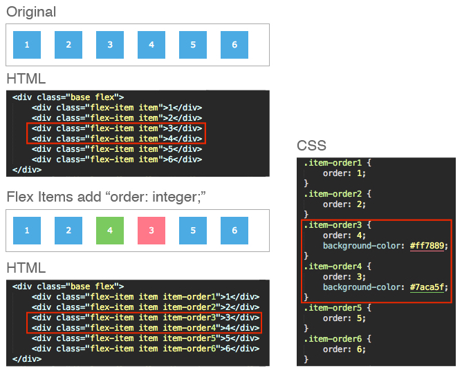
order
order 屬性用來控制 flex items 出現在 flex container 的順序。數字越小,出現次序越前面。數字相同,則照排列出現。
下圖中 4 在 HTML 的結構上是排於 3 之後,應該為圖中 Original 的排列次序;在 flex item 上加了 order 屬性就可以更改原本顯示的順序。
.item {
  order: number;
}
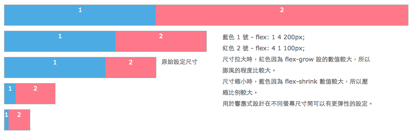
flex-grow
flex-grow 在 flex container 拉大時依照比例放大,數值越大長得越大,不能使用負數。
.item {
  flex-grow: number; /* default 0 */
}
flex-shrink
flex-shrink 在 flex container 縮小時依照比例縮小,數值越大縮得越小,不能使用負數。
.item {
  flex-shrink: number; /* default 1 */
}
flex-basis
flex-basis 是 flex item 的基本大小,預設值為 0,未設值時會直接使用 flex-grow 的設定,或者設為 auto,表示 flex item 以自己的基本大小為單位。
.item {
  flex-basis: length | auto; /* default auto */
}
flex
flex 集合 flex-grow、flex-shrink、flex-basis 三個屬性,flex-shrink 和 flex-basis 是可以省略不設值的,預設值為 0 1 auto,建議使用 flex 集中一次設定。
.item {
  flex: none | [ flex-grow flex-shrink flex-basis ]
}
align-self
align-self 可針對個別的 flex item 設定對齊方式,改變 flex containter 原先的 align-items 的設定。
.item {
  align-self: auto | flex-start | flex-end | center | baseline | stretch;
}
Note: flex item 對於 float、clear、vertical-align 這幾個傢伙是沒有感覺的,不會有任何反應。
以上是目前對 CSS flex 屬性設定的說明,由於 flex 在空間佈局和內容對齊有相當彈性的設計,非常適合用於現在多元裝置和不同螢幕尺寸大小間的響應式設計,在 React Native 中也是採用 flex 來做 UI 的配置,這一部份在下篇 React Native UI 佈局與 CSS Flex會進行說明。
參考資料: